

A typographic commitment to the bit: Creating unease
How on-screen typography creates discomfort before you understand why

Spoilers ahead ⚠️
The following films and series will be discussed with spoilers: Bugonia, Pluribus, and The Beast In Me.
Can you remember the last time typography in a film or series had an impact on you?
If you can, you likely remember what it looked like rather than what it made you feel. Sometimes it’s obvious — like the distinct, blocky, bread-tag-esque title font in the film Bugonia. But more often than not, typography unobtrusively shapes an audience’s viewing experience — becoming part of the on-screen world itself, like the messages Carol receives through her TV screen in the series Pluribus.
Over the past year, I’ve collected moments like these. Moments where creators committed to typographic choices that shaped how I experienced what was unfolding on screen. This is the first post in a series exploring the paradox of refusing shortcuts in film and television typography. When creators commit fully to typographic craft, even details most viewers will never consciously notice, that invisible effort is what makes the storytelling work.

Creating unease
Bugonia (2025)
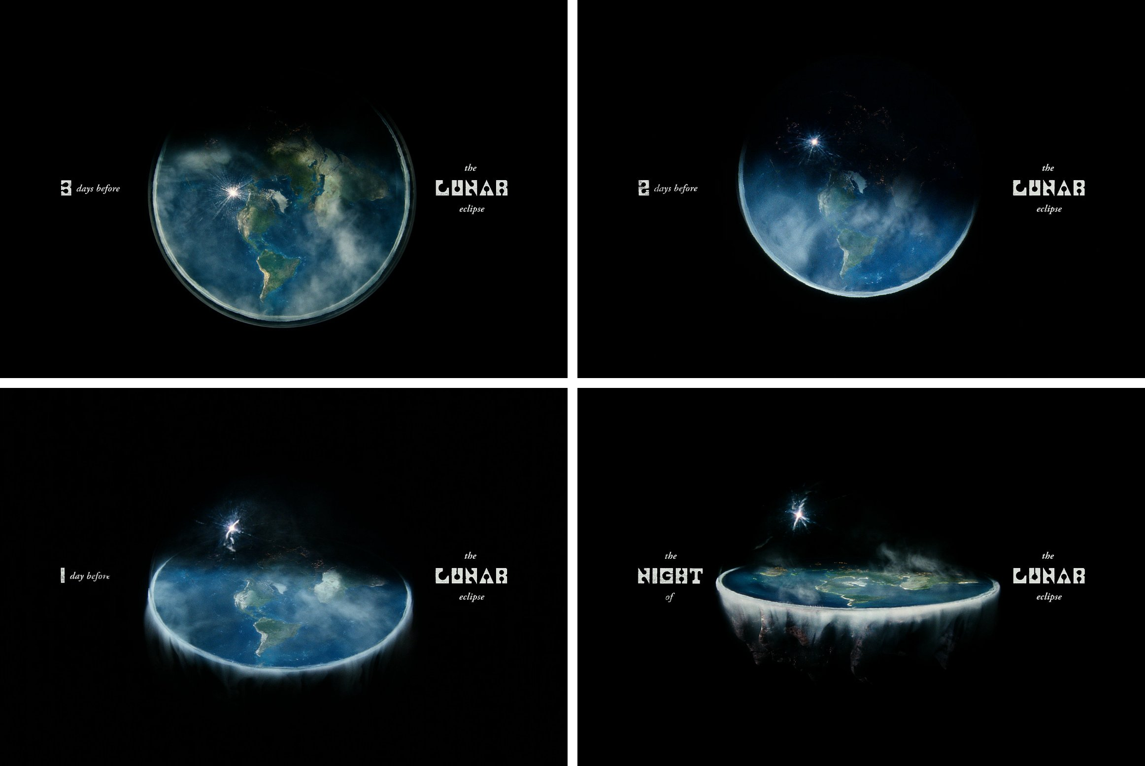
Expect something weird to happen
A bald Emma Stone, honey dripping, and blocky, semi-readable letters with perfect circles as counter shapes. The Bugonia movie poster and title design primed viewers for strangeness.
Vasilis Marmatakis, graphic designer for the film and longtime Lanthimos collaborator, drew direct inspiration for the title from a 2002 type specimen showcasing Churchward Roundsquare, a font by the late Samoan New Zealand designer Joseph Churchward.

Churchward Roundsquare is a font full of contradictions. The characters are geometrically constructed as if Churchward used an x-acto knife on square paper, cutting away the parts he didn’t need, and a hole punch to create the counters. It doesn’t exactly have traditional serifs nor is it really a sans-serif. The apertures (the open space in a letterform) are extremely thin openings connected to the circular counters. Isolate many of the letters on their own and you’re unable to tell which character it is.
The font seems to defy all the rules of typeface design. Churchward didn’t add unnecessary distinguishing details and instead relied on primitive shapes and pattern recognition to create a surprisingly readable font. This feeling of ‘it shouldn’t work, but it does’ mirrors the emotional journey: is Emma Stone’s character an alien? Of course not. The kidnappers are conspiratorial extremists. Wait. Are they? Is she actually an alien? No. Obviously, they’re batshit crazy. Oh my god, they’re not. SHE IS AN ALIEN.
The typography creates a sense of unease through its use of a font that looks alien yet familiar. It’s immediately readable but if you take a look at any of the details of its construction and you’re left scratching your head.
We see Churchward Roundsquare appear a few times throughout the film: first when the title drops, second when it cuts to four inserts of a countdown to the lunar eclipse, and as an anchoring element in the credits. But the font choice was only part of Marmatakis's creative choices.


In an interview with It’s Nice That, Marmatakis shared that he loved this font “because it feels monumental yet sharp, even a little threatening. It struck me as futuristic, but in a very analogue way, which is, in a sense, exactly what the film itself is.” True to this philosophy, the movie is typeset through an analogue approach as well. The type-making process involved printing the letters, splashing water on them to create a smudging effect, scanning the results, and then digitizing them. This is especially apparent in the first “N” we see in the credits above. Marmatakis created many iterations of each “watered” letter.
Marmatakis almost certainly understood that most viewers will never learn about the incredibly manual and time-intensive process that happened behind the scenes to create the type they see on screen. The visual treatment could have been rendered far quicker with digital paint brushes in Photoshop. Yet that’s precisely the point — when you care about your craft, you commit to the process even when the audience will never see it.
Pluribus (2025)
How the Hive communicates with Carol
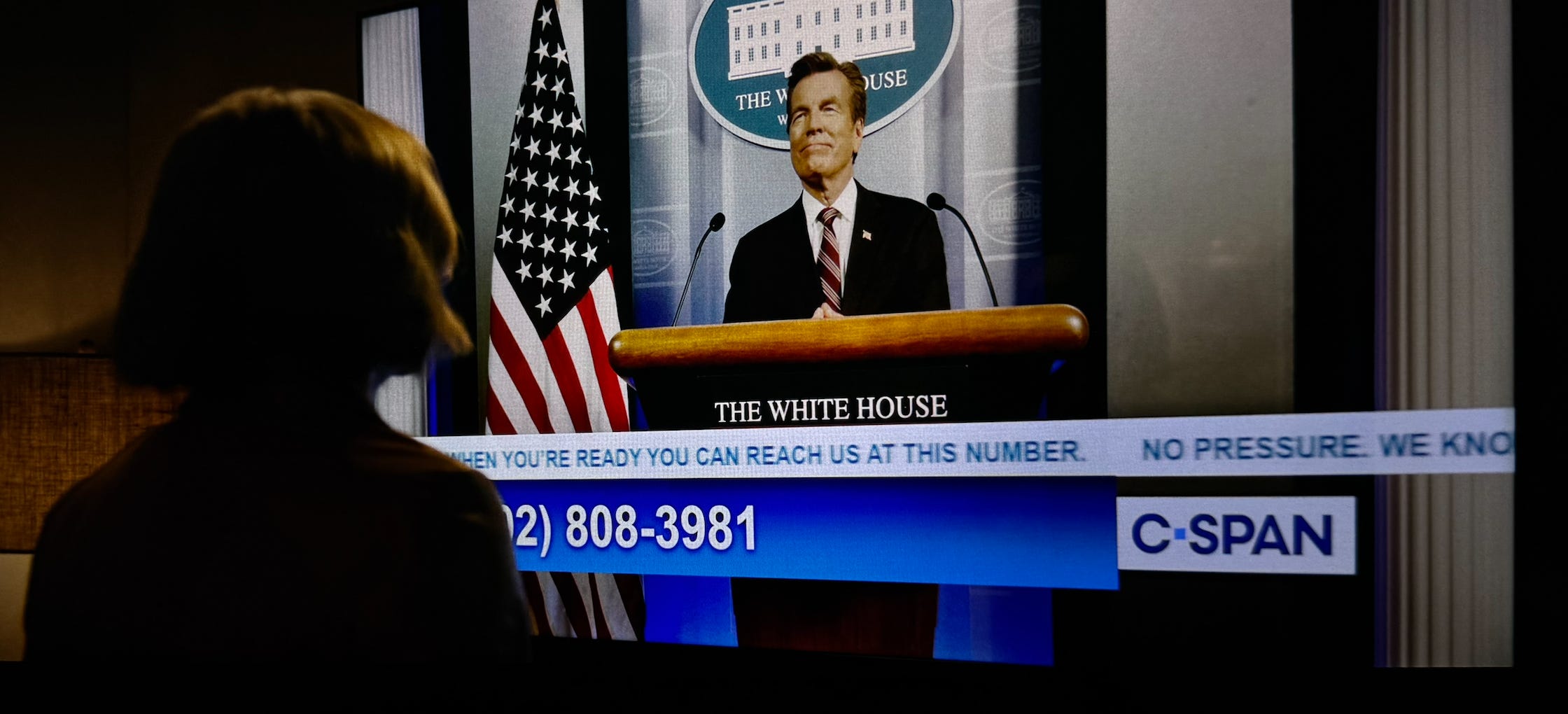
I don’t mean to take away the spotlight from the countdown that appears on screen every episode — but the jaw drop moment for me was when the Hive started sending messages to Carol via her TV and landline. Like Carol, I was lulled into a false sense of safety when she finally flipped to a TV channel that was broadcasting what looked to be an official announcement from The White House. Finally, an explanation for whatever the hell has been happening in all of episode one, right? Wrong. The creators knew what environment was needed to create that sense of security so that when the realization dawns on Carol (and us) that rug pull moment is that much more impactful.
The banner of text that scrolls horizontally at the bottom of screens like this is called a chyron (though “ticker” might sound more familiar). Chyrons typically provide extra information, create urgency, or display real-time updates. It’s something we expect to see when watching a show like C-SPAN. Because our brains are wired for pattern recognition, we stop paying attention when we see something in the same place enough times. That’s exactly why it feels so unsettling to see the messages that say “It’s us, Carol” appear in the chyron and on her landline: it breaks the patterns we’ve gotten used to.
The reveal of the Hive’s omnipresence isn’t explained through exposition, but shown by hijacking typography that normally fades into the background. We see their omnipresence become part of Carol’s immediate environment. It’s an invasion shown through typographic surfaces that we take for granted.

The Beast In Me (2025)
Setting the tone in the title sequences
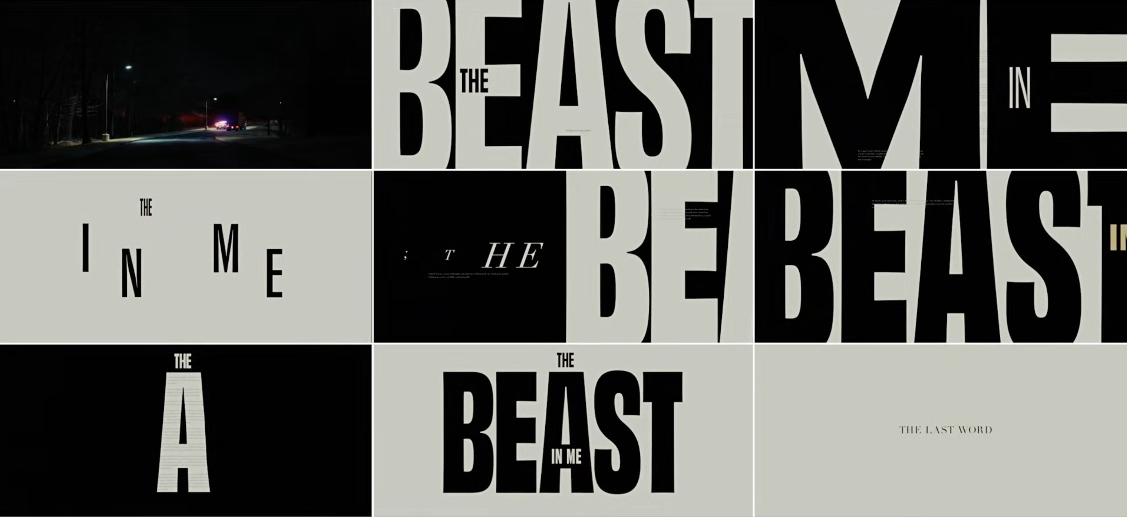
Claire Danes’s quivering lips were a close second to my actual favorite thing about The Beast In Me: the eight custom title sequences that appear at the beginning of each episode. The title sequences are entirely text-based, relying on a tight combination of typesetting, motion, music, composition, and restraint to create feelings of unease in viewers.
You can watch all eight title sequences here.
This analysis from The Video Shop reveals many of the choices and context that shaped how ARC Creative designed the sequences. Most surprising is that the creative team didn’t see any footage prior to designing the titles, they only had access to the script.
ARC used Obviously by OHno Type, a highly robust variable font. Variable fonts operate differently from regular fonts. Regular fonts provide users with a set number of weights (or axes) such as light, regular, bold, black, condensed, narrow, wide, ultra-wide, etc. Variable fonts let users choose any instance from that spectrum. If, for example, semi-bold isn’t bold enough for your needs but bold is too bold, a variable font will allow you to choose a weight that’s in between both weights. The use of a font like this in The Beast In Me gave the designers the freedom to use every axis of the font, while still maintaining a cohesive typographic voice. But the font choice alone didn’t create the atmosphere of unease.
The type-setting and motion punctuates every movement of the bow against the violin in the eerie theme music. Art director Ilgi Candar Dyer shared with The Video Shop that the BPM of the music in each sequence increased with each episode as well. Comparing the music of episode eight to the first one, there’s a stark difference in the tone and sense of urgency.
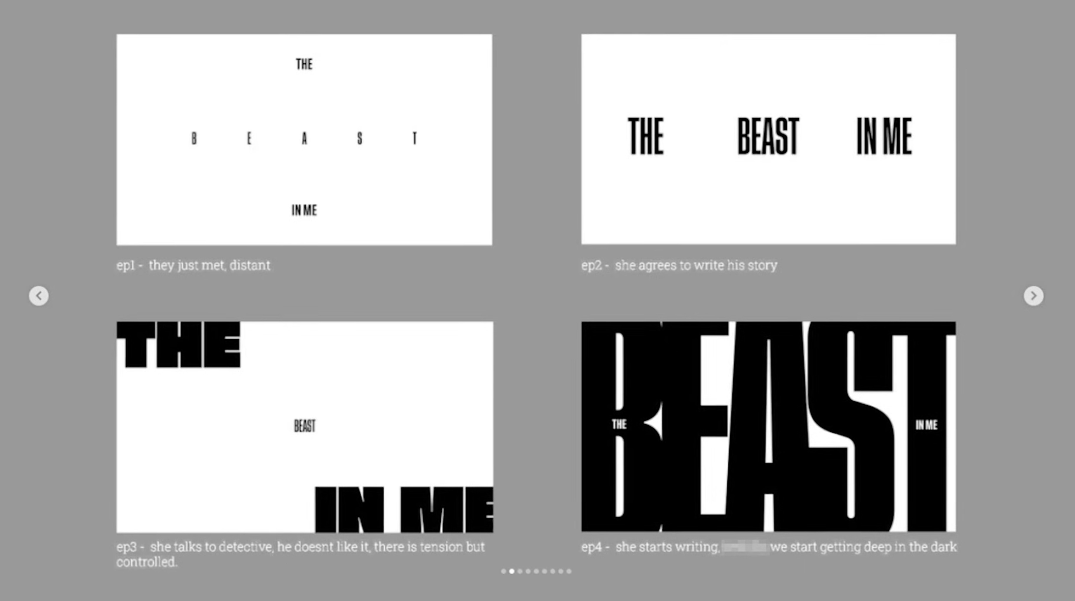
The composition of the type mirrors what is happening in the episode. In episode one, Claire Danes’s character is eager to not meet or get to know her neighbor played by Matthew Rhys — thus, the text is set with extra wide letter-spacing, the weight is bold but extremely condensed. In episode two, when she agrees to write his story, the type gets a little bigger, is still bold and condensed, the letter-spacing has decreased significantly, but the word spacing is still large indicating that there is still some distance between them. In episode four, we see the word “beast” breaking the boundaries of the screen, its scale massive compared to the rest of the words, and the letters are touching. In this episode she learns some darker truths as she starts writing and there’s a sense of both the unknown and a claustrophobic feeling from this story starting to take over her life. By episode eight, the pieces have fallen together but our protagonist isn’t safe yet. The chaotic, collage-esque composition of the title sequence is reminiscent of a conspiracy evidence board.

This is commitment to typographic storytelling at its finest. ARC could have created one template and simply adjusted the timing to match each episode's increasing BPM—a shortcut most viewers would never notice. Instead, they created eight completely unique title sequences that aligned to narrative and emotional progression. The Beast In Me succeeds in doing something even the most experienced creative teams often get wrong: they used restraint, which gave them the freedom to lean into chaos and the feeling of mounting dread where it mattered most.
When a creative team is so deeply aligned on a goal, it creates the kind of constraints that produce creativity in unexpected ways: from finding obscure sources of type inspiration to using everyday design to subvert expectations to evolving title sequences with minimal elements. The craft lives in the invisible details — details that most viewers will never consciously notice — making the discomfort linger.
Next in the series: how typography reinforces absurdity.