
Designing a logotype for Plumb
Have you ever looked at a logo and wondered “why did they do it like that”?

I wrote this to provide insight into my thought process and the smaller design decisions that happen when designing a logo from scratch. Starting by hand is integral to my personal design process and I also wanted to showcase how I use calligraphy, lettering, and type design to create logotypes.
The brief
Design a wordmark for Plumb, a no-code AI feature builder for SaaS teams (where I also happen to work). I approached this project differently compared to other brand work I’ve done as an in-house designer: I decided to treat the team like they’re a freelance client of mine and worked with Aaron as my “point of contact” and decision maker.
The name Plumb was inspired by MarioBros and chosen by Chase Adams, the engineer who created this framework while working on Supermanage.
Brand exercises
A blank canvas. I begin every brand project with a couple of brand exercises. Aaron and I brainstormed themes, visual keywords, colors, and brands we were inspired by. At its core, Plumb is a software infrastructure product so we also looked at the brand spectrum of (non-AI) infrastructure tools. During this stage of the process I try not to spend too much time looking at what similar brands are doing, just enough to be aware of what I want to avoid. I’m particularly cognizant of being influenced by what’s already been done because whether I like it or not, my subconscious remembers.

Q&A exercise. This is an exercise I usually reserve for clients who are creating logos for their personal brand — I ask them questions about their values, principles, motivations, influences, etc. I adapted this for Plumb with a Q&A titled “If Plumb were a person…”. The benefit of this exercise is to help me understand how a client is thinking about their brand (or product) at a deeper level and any assumptions they may hold. In short, it helps me bring the abstract qualities of a brand to the surface. I took the Q&A answers and went through a process of grouping them and forming 5 themes to inform the next step in the process: moodboards.


Moodboards
In my process, the purpose of moodboards is not to offer visual inspiration to clients but rather to answer the question of how a client wants their brand to be perceived — what’s the vibe we’re aiming for? Each moodboard theme spoke to a product value or philosophy:
Collaboration: Plumb enables collaboration across engineering, product, and design.
Translation: Plumb takes the complexity of building (engineering) AI features and distills it into a tool that is usable through a visual interface.
Accessibility: Plumb makes the ability to build quality AI features available for everyone — engineer or not.
Creativity: Plumb takes away the complexity of building AI and allows users to focus on ideas.
Sustainability: Plumb provides the infrastructure for building reliable and quality AI features for users.
Of the five themes I chose three to create moodboards around: collaboration, accessibility, and sustainability:
Moodboard 1: An Anthology of Imagination
Inspired by groups of people who are creative and cultural forces in this world. It’s about coming together to create something that is greater than the sum of all its parts.
Moodboard 2: Anyone Can Cook 🐀
Inspired by creators who were/are polymaths: not masters in just one craft, but many. Based on the idea that anyone should be able to build with AI — engineer or not.

Moodboard 3: Organic Infrastructure
Inspired by artists whose rigid and structured processes enable them to create wildly creative and innovative work. Based on natural and manmade infrastructure found in the world. I was particularly inspired by sand dunes and rivers as infrastructure.

The team chose moodboard 2.
Sketching and Ideation
This tends to be the least formulaic part of my process. It’s where the prep work I did with brand exercises and moodboards (hopefully) meets opportunity and inspiration. Before I get to this stage I tend not to let myself think about what shape the logo will take visually. I intentionally let ideas be “fuzzy” and instead aim to hold the concepts (vibes) I’m working towards like an anchor in my mind. Processing like this lets me filter ideas and narrow down to concrete concepts quickly.
I sketched out a number of concepts and imported them into Procreate where I cleaned them up — my favorite being a concept I sketched out with a Pilot Parallel calligraphy pen inspired by the SF Muni logo.

I presented two final concepts:
Concept 1
Concept 1: Inspired by the italic m in the font DaVinci by Virgile Flores (seen in moodboard 2) and algebraic variables. In algebra, the letter “m” refers to the slope of a line which determines both its steepness and direction.
I used Public Sans to illustrate this concept digitally and altered the m in Figma. Because of time constraints I chose not to draw the concept from scratch in Glyphs and in retrospect that was perhaps my first mistake with translating this concept digitally. When presenting this concept to Aaron, we both knew something didn’t quite work.
Things I would have tried if I had more time: a monolinear stroke design, wider characters, a lighter weight, and a slab serif design.

Concept 2
Pipes inspired by the San Francisco Municipal Railway (MUNI) logo. I rendered the sketch in Glyphs so that I could redraw each letter to be solitary, making it closer to type in design. I also extended the character widths — they were too narrow in the original design to work when cleaned up. I also presented the connected version because sometimes you just need to feed the soul, yknow?

I presented to the team and they chose concept 2.
Drawing in Glyphs
Note: since I have a background in typeface design I’m most comfortable drawing vectors in Glyphs. I’ve tried to go back to Illustrator but the lack of precision tooling always takes me back to Glyphs.
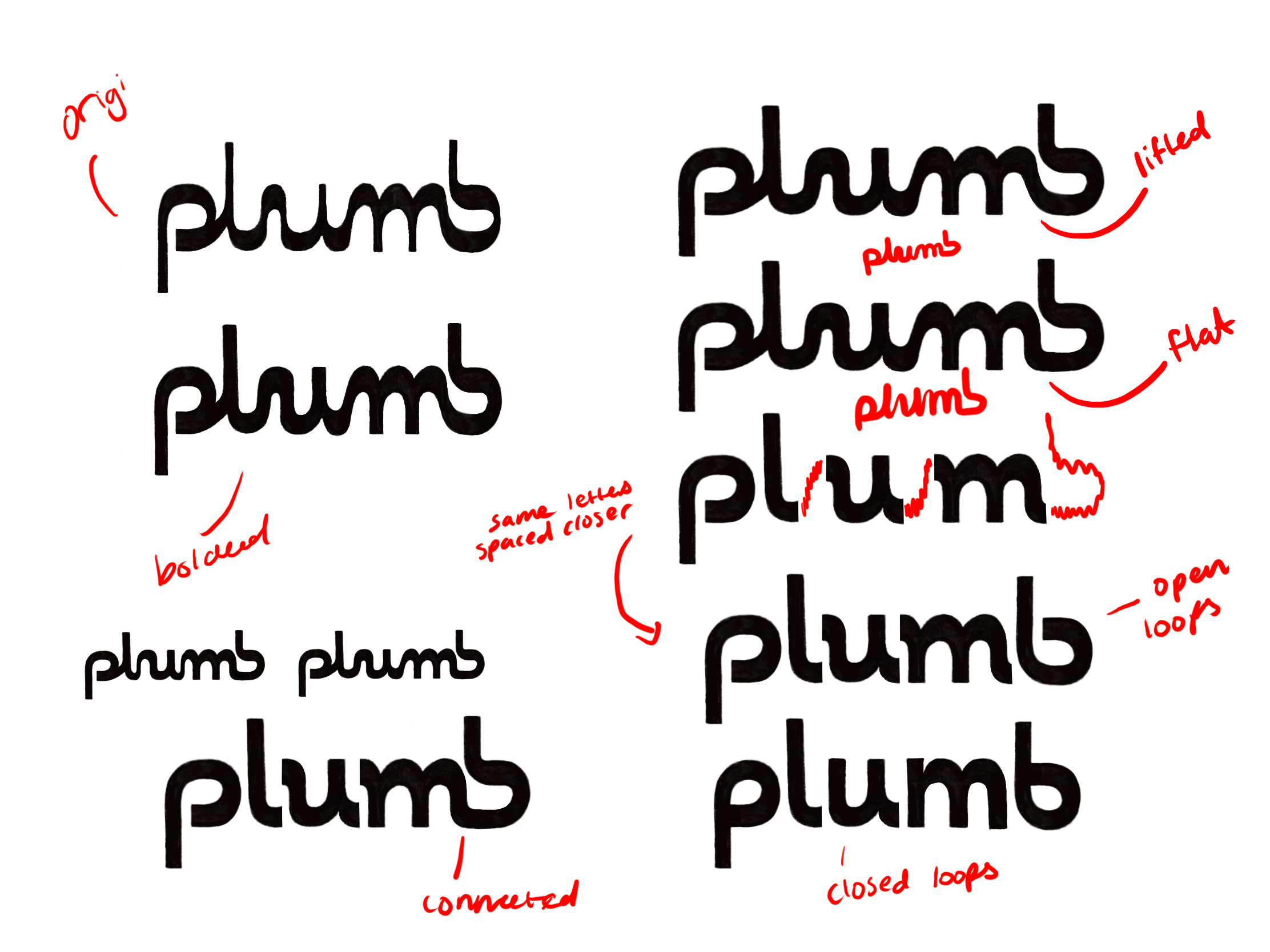
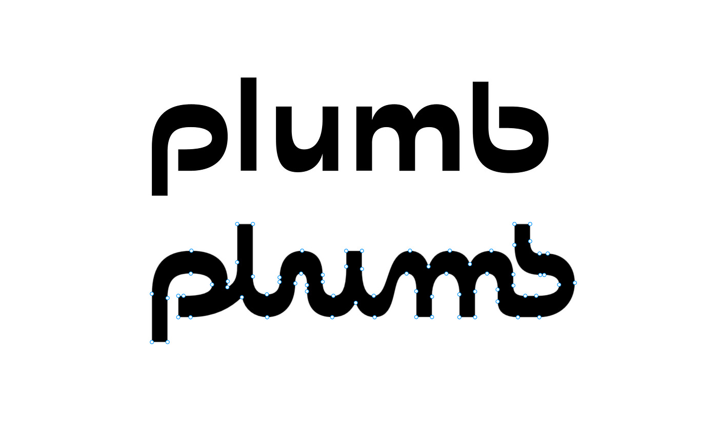
When I moved over to Glyphs I started by drawing the single stroke sketch. After I created the initial outline I started isolating each letter and turning them into single characters. The biggest deviation from the original sketch was the separation of the combined M B (which was also the most difficult part to translate digitally). However, this separation created an opportunity for P and B to mirror each other. The disconnected design for P and B was taken directly from the original sketch. Since I was making a rough concept I didn’t pay attention to character or counter widths, uniformity, over/underhangs, or finessing the design too much.
After getting feedback from Aaron I continued refining the logo in Glyphs. The main feedback was around the distribution of contrast. In attempting to keep true to the spirit of the original sketch I had kept the horizontal contrast (more commonly called reverse contrast) in the design concept that I presented. The contrast was created by the broad nib of the pen being held at a 90° angle. While I decreased the contrast in my design (compared to the pen sketch) it was still too noticeable, particularly in the bowl of U and the top of the M.

I implemented changes that made the design optically monolinear (but if we’re going by metrics, it technically still has horizontal contrast). Designs like this are broadly referred to as sans serifs. It may seem silly for me to define something so obvious but when I look at the design, even in its monolinear form, it’s hard for me to not see the influence of the pen. Most sans-serif typefaces with origins in calligraphy are classified as “humanist sans-serifs”. Their designs are distinct from other sans-serifs because they show evidence of a hand holding a pen. Perhaps unsurprisingly, that’s why the final design felt slightly evocative of Antique Olive by Roger Excoffon, a typeface notable for it’s subtle reverse stress.

Another change I implemented was rounding the joints where the shoulder of the M and the bowl of the U meet stems. It was a small ode to the warmth and bounciness of the connected calligraphic design.

The final challenge I had was reconciling the high contrast at the joints in U and M with the lack of contrast in P and B. If I was following the rules of typeface design, it didn’t make sense. I tried a version with decreased contrast and instinctively knew it didn’t work, but because it “followed the rules” I couldn’t rationalize to myself why. I presented it anyway and Aaron had the same instinct as me. Thankfully, it’s not a typeface and the rules don’t matter as much.

The last thing I worked on was spacing. I don’t have much to say about that because I don’t particularly enjoy doing it. 🫠
Where does that leave it now?
The logo can now be seen in use on useplumb.com✨
I also experimented with adding a variable axis of low to high contrast to the design. That’s all I’ll show for now, but I’m continuing to explore where the brand will go. And while I don’t necessarily want to design in public, I’ll occasionally share some more deep dives into the design process of Plumb and other logotypes I design.