


The serif renaissance in AI branding, the typography of Severance, and what happens to our posts when Instagram dies?
Typographic observations that have caught my eye in early 2025

I’ve been noticing typographic curiosities everywhere in popular culture lately. Rather than forcing each one into a full post I’ve gathered them into a roundup of sorts.
These are details that most (normal) people miss but that type designers like me can’t help noticing. I’m also a big culture nerd and couldn’t miss an opportunity to look at culture through the lens of these typographic observations.
Here’s what I’m covering at a glance:
🤠 Why are AI brands obsessed with using serif fonts in their branding?
🪷 White Lotus adding Thai subtitles behind the English subtitles
🕰️ A confused clock in The Electric State (you know, that latest Russo brothers flop that cost $350m to make?)
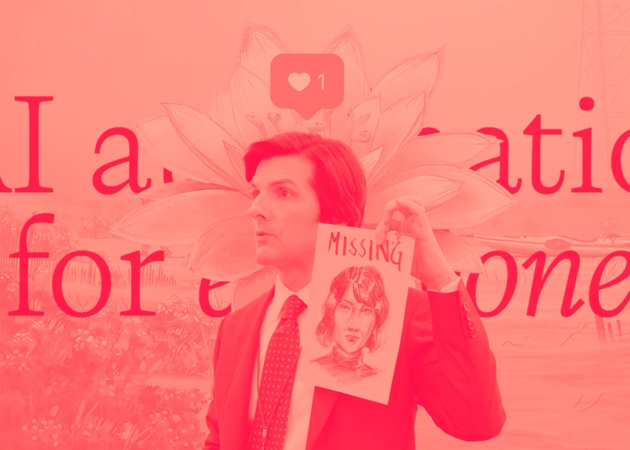
💧 A font mystery in the Lumon logo and the sci-fi history of the Severance typeface
📱 What happens to years of, not only photos, but captions and comments on our Instagram posts when or if Instagram dies?
🤠 Why are AI brands obsessed with using serif fonts in their branding?
From the POV of a brand designer working at an AI startup.
If you work in tech as a designer or someone who is design-adjacent you might have noticed the recent trend of AI-native brands pivoting their typeface of choice to one that has serifs.
I first noticed it with Claude:

Then came the rest, adopting serif fonts either across their entire brand or showing up in certain touch points only (like Perplexity).


It’s not that difficult to discern why AI-native companies in particular are being drawn to serif fonts: AI is inherently cold and without opinion. Serifs add visual interest and warmth. It signals “we’re AI! but real humans use (and made) our product! we swear!”
I myself am unequivocally guilty of this serif-as-humanity signaling. I was drawn to Calvino for similar reasons—seeking a font with personality and warmth, that still felt refined. I also have a personal preference towards fonts that are rooted in calligraphic structures (my opinion about my own taste in type is clearly biased since I’ve studied typeface design and calligraphy for years so when I opine about it, it’s totally fine and not pretentious /s).

We were originally using Instrument Serif on the Plumb site in order to validate the idea that a serif was the right type of font for our brand before investing in a paid font. While I view this tendency towards serifs (particularly the condensed Caslon-inspired styles) a trend, I hope more AI-native companies do the work required to decide whether a font with serifs is genuinely the right choice for their brand identity.
It’s telling that a company like ChatGPT doesn’t use serifs. They know who they are and what they are and have deliberately aligned their typography with their identity and positioning.
However, it cannot be denied that there is a certain irony in using distinctly human typographic touches to present something fundamentally non-human. The pessimist in me could argue that this trend is simply in service of furthering the capitalist goals of these businesses. The optimist in me could argue that this compulsion to look and feel more human aligns with the notion that using AI frees up time for people to focus on their more meaningful pursuits. As with most things, the truth probably sits somewhere on a spectrum—leaning a little more towards capitalism if I had to plot it. I guess I’m more of a realist than I thought.
🪷 White Lotus adding Thai subtitles behind the English subtitles
If, like me, you’ve been keeping up with season three of HBO’s White Lotus for the last five weeks, you might have noticed something interesting with the subtitles. This season takes place in Thailand and when characters speak in Thai, a slightly transparent black Thai font appears behind the white font showing the English translation.

I was both confused and somewhat pleasantly surprised when I saw this. From a usability and accessibility standpoint, it’s awful. The Thai is completely unreadable and it makes the English subtitles harder to read, especially if you already have issues with vision.
From a brand perspective it’s…interesting. And interesting isn’t necessarily bad. I tried to reverse engineer this typographic decision and came to the following conclusions:
The White Lotus team is assuming the audience doesn’t know how to read Thai and therefore won’t care if it’s unreadable in this layout — and honestly, it’s a fair assumption given it’s an HBO show with a primarily North American audience.
Someone pitched this as a way to pay homage to Thai culture while Thai is being spoken on screen, and they ran with it.
No one on the team understands anything about typographic accessibility.
They didn’t have the resources to consult with a type designer on this. And more likely, their graphic designers, who don’t have experience working with the Thai script, worked on the design.
It feels unlikely they thought about it much deeper than that. Could they have? Certainly. But the unfortunate reality is that this kind of typographic application in TV and film is often an afterthought. Either way, it’s been interesting to see a popular mainstream show try something typographically new (even if the execution could have been better).
🕰️ A confused clock in The Electric State
Don’t ask me why I watched this mess of a movie, but I did. And I noticed something weird that only a type nerd would see.
To give some context about this scene, you need to understand the premise of the movie. Robots became…sentient? And demanded lives of their own. They were denied and made to live in this “exclusion zone” in the middle of a desert that has an abandoned mall in it. So we, as the audience, are meant to assume that this clock is just a fixture in the mall that’s been slowly degrading over time.
Now: look at the numbers 6 and 7. And then look at it upside down. I see a 9 and 2 being used in place of a 6 and 7.


The serif/tail part I circled in red in the 7/2 design confuses me. It doesn’t really work as a design detail in either numeral which leads me to believe maybe it was intentionally designed look like this. But if it’s intentional, what is it trying to say about the world that exists in this movie? This detail never comes up again and feels like a pseudo-clue that’s meant to convey how things are “off” in this world where robots are sentient, but it just doesn’t land for me.


You might be asking, so what, Keya? Why does this matter? And the answer is, it doesn’t (like, really, truly, doesn’t). But the curse of being a trained typeface designer means you pick up on details like this all the time.
For a movie with a $350 million dollar budget, you have to wonder why and how this happened. It’s clear most of that budget went towards the CGI. And quite honestly, I don’t know if this clock is real or CGI. If it’s CGI and not a real clock it makes a lot more sense. But if it is a real clock—not made by the prop department—it just became a lot more interesting.
💧 A font mystery in the Lumon logo and the sci-fi history of the Severance typeface
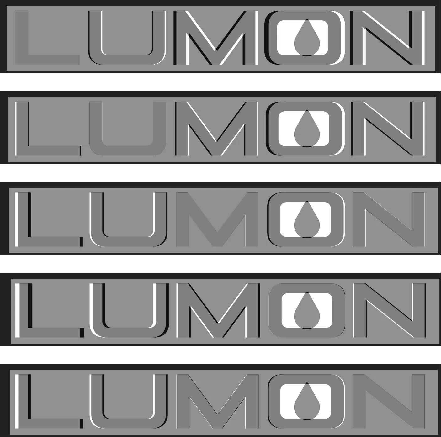
According to the Severance Wiki, Manifold Extended, is employed as the Lumon Industries corporate typeface. I was curious to see if the creative team working on Severance customized the font for use in the logo so I went to the official Lumon site hoping to extract an SVG file of the logo that I could compare to Manifold.
That’s when I noticed something was off with the font. It didn’t look like Manifold.
There were three clues that led me to believe this:
Clue 1: the letter U
Clue 2: stroke weight discrepancies
Clue 3: the treatment of corners


Clue 1: the letter U
The radius of the inner rounded corners is distinctly larger than the rounded corners in Manifold. It felt less “square” than Manifold because of this. And there is a higher contrast in stroke widths compared to the more subtle contrast in Manifold. The bottom stroke of the U is noticeably thinner in the Lumon logo.
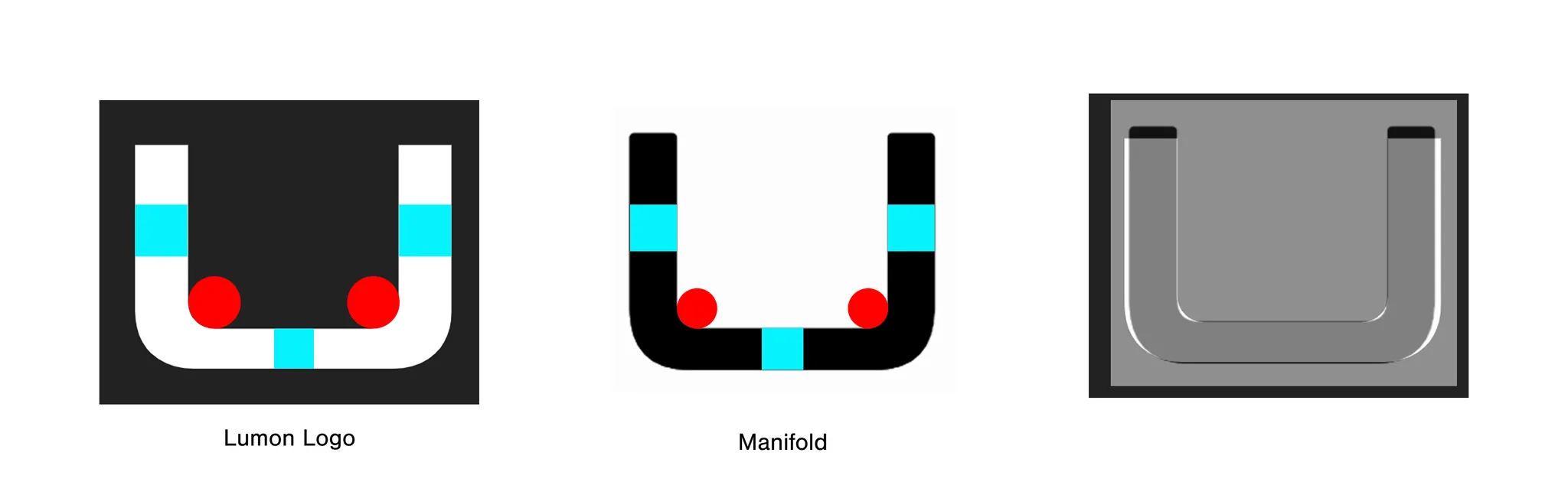
Clue 2: stroke weight discrepancy
I noticed the Lumon logotype felt heavier in the M and the N compared to Manifold.
Taking a look at the M first, you can see how the inner vertex in the Lumon logo starts much lower than the inner vertex in Manifold, creating an M that has a heavier color. A similar thing occurs in the N but with slightly more subtlety.

Clue 3: the treatment of corners
Manifold is doesn’t have any (or many) corners. The font description says it is “tempered and softened with a hint of warmth”, and though it doesn’t explicitly call out the roundedness, every stroke ending has a small rounded corner where one would expect to see a sharp corner. The Lumon logo has many corners.
The devil is in the details
After collecting these clues, the verdict was clear. A quick search on What the Font reveals the font to be Akrux Bold. I confirmed this by overlaying Akrux on top of the official Lumon logo—the spacing is adjusted in the logo but it is undeniably the same font.
Manifold Extended and Its Influences
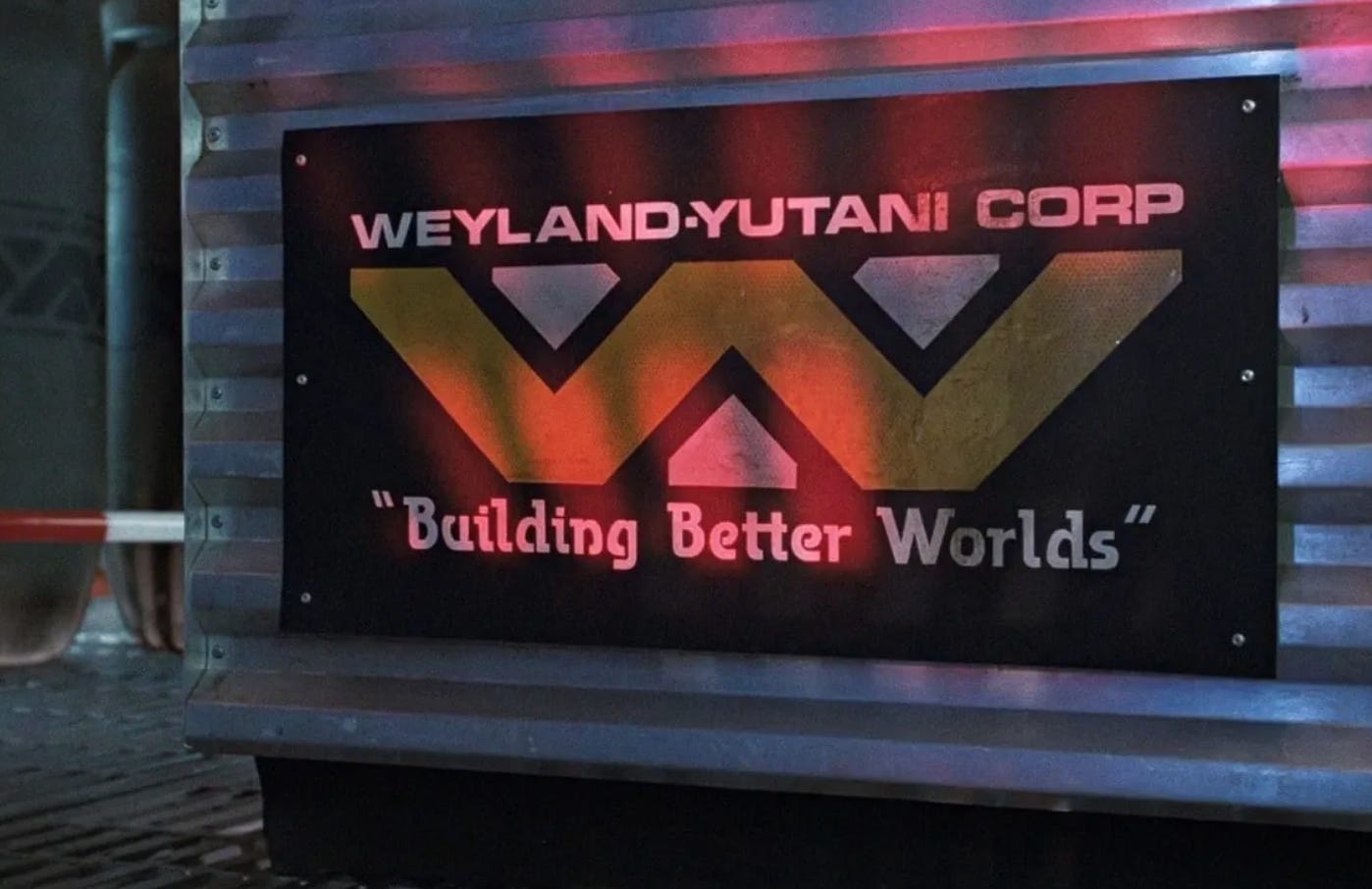
Manifold Extended is a sans serif typeface that employs squared letterforms with rounded corners. It draws its design inspiration from the “precision of a computer terminal, then tempered and softened with a hint of warmth”. And while Fagen does not explicitly state that Manifold is inspired by Aldo Novarese’s Microgramma or Eurostile, there are parallels in their designs.
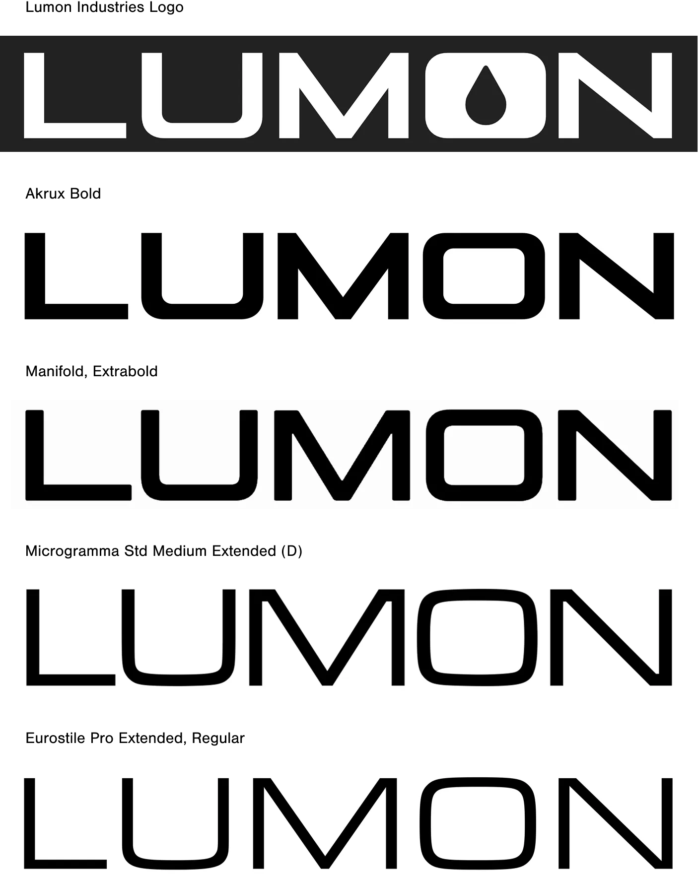
Microgamma in particular has a history of being used in science fiction films and tv shows. Fans of the Alien franchise may recognize it in the Weyland-Yutani Corporation logo. It was also featured in Star Trek, Back to the Future, and Way Out to name a few more.
Manifold is a well designed, clearly intentioned font, that agonizes over the small details. In contrast, Akrux feels like it was mechanically (and somewhat sloppily) designed as a full font.
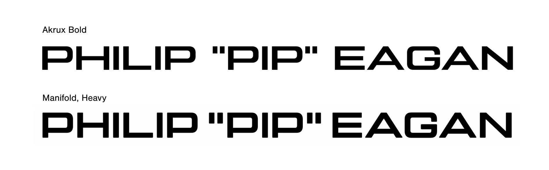
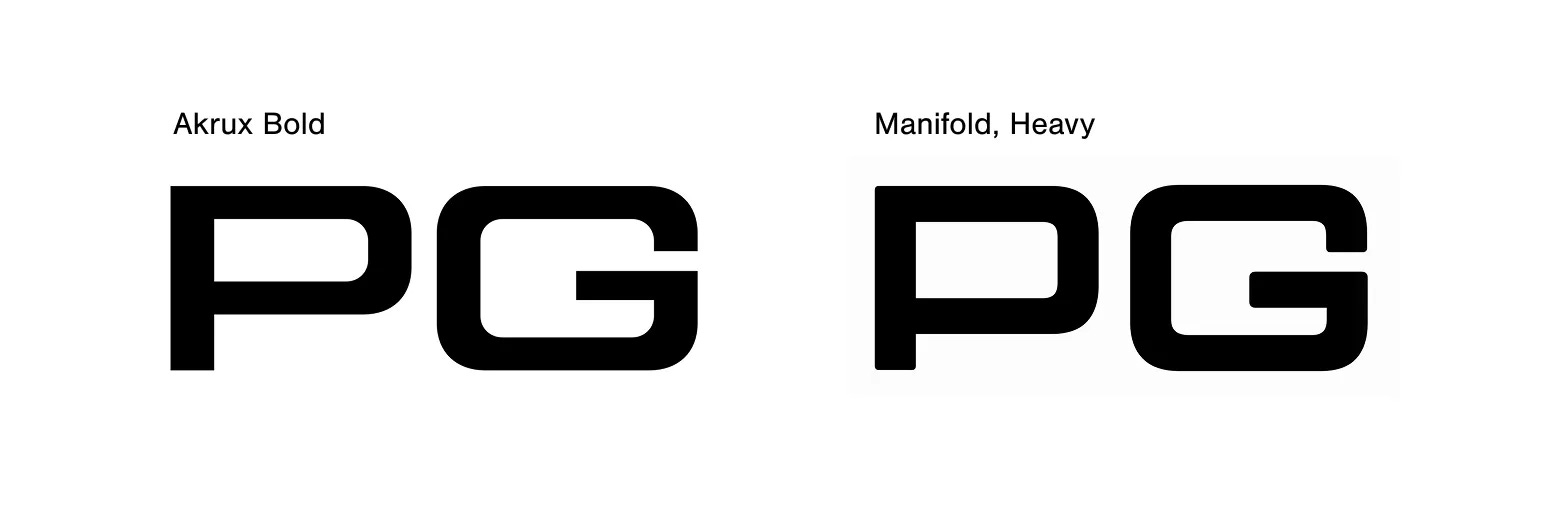
Manifold employs a lower waist compared to Akrux. A waist is “an imaginary line passing through the optical center of a character.” Doing this in a squared, extended font like this helps keep the letterforms slightly more proportional—as evidenced in the letter P in the above example—and less “squished” looking. The counter space in the P feels more open in comparison to the P in Akrux. It also helps with readability.
Manifold knows how to handle roundedness. If I was still teaching type design and giving the designer of Akrux a critique, I would advise them to decrease the inner corner radius. It’s a small detail that makes all the difference. The counter of the P and G in Manifold are distinctly more square, which helps make the P look more like a P and the G look more like a G. It may seem counterintuitive, but this small detail actually helps them be more readable and recognizable as the letters they are because those corners take up less space and don’t draw your eye in as much.
The Severed typography of Lumon
Severance is about people who sever their work self from their non-work self through a medical procedure that puts a chip in their brain. They refer to their non-work selves as “outies” and work selves as ”innies”. Each version of themselves lives in the same body, but has a slightly different personality from the other.
Is there a similar parallel between the choice to use Akrux for the Lumon website logo—a public facing mark that Lumon outsiders see—and Manifold for the internal brand system that only Lumon employees see?
The logical and rational side of me knows that it’s more than likely just an accidental oversight in the art department. But as a type nerd—I love it. It feels completely in line with the themes and philosophy of the show that there might be something “off” with the logo. Everything about the set and production design is manifested in a way to cultivate a sense of unease and like something isn’t quite right.
Just as the characters have divided selves, done so at the hands of humans, Lumon’s inconsistent typography contains its own internal division. The only mystery left is: how?
📱What happens when Instagram dies?
And why this is an inherently typographic issue.
I’m equal parts techno pessimist and optimist. I loved Instagram back when I actually posted photos of my personal life to my feed. I have years of memories stored there. And I’m scared that one day, Instagram won’t exist and I will lose those memories. If or when that day happens not only do I lose those posts, but I also lose the conversations and comments that happened under those posts.
The photos on my feed don’t all digitally exist elsewhere. And the ones that do exist in my cloud storage, don’t have the comments left my friends and loved ones—this is, in my opinion, what distinguishes Instagram posts from just being photos. My Instagram posts are currently digital ephemera simply biding their time until they don’t exist one day.
The importance of archiving digital memories wasn’t really emphasized when we started embracing smartphones—instead, our photo galleries became a dumping ground of sorts for any and all kinds of images.
I may be prematurely worried about this. But there’s something dystopian about how preserving memories has become synonymous with upgrading our cloud storage…or posting on our Instagram feed instead of on Stories. There’s no guaranteed longevity to any of it like there is with physical photo albums.
You might be wondering how this is at all type-related. I argue that the textual
experience of Instagram is integral to the overall experience of the platform. The experience of Instagram would be vastly different without captions or the ability to comment. Fonts power our ability to do that, as does Unicode, as does the keyboard shaping and layout technology that lets us click on a little button labelled “a”.
What we’ve written online matters. Even if these memories are digital, we put time and effort into writing captions that felt unique to us or comments that expressed how we truly felt. While there has been a shift away from using Instagram this sincerely in recent years, I still feel a yearning to preserve those golden years where we interacted on the platform like that. When Instagram disappears—and there’s a very real possibility that it will even if its years away—so does this typographic environment that contains our memories.
Thanks for reading! What typographic phenomenons have you observed lately?
I agree with you on your White Lotus part, it's cool, but more in a "indie game trying something new that could still be improved" way than a "big company impressing move" way. This was a great read!
Love this so much!! Though I do think it’s important to note the Lumon site is fan made and not officially affiliated with the show